The Barefoot Followers of Sweet Potato Grace
Client Lanternfish Press
Project The Barefoot Followers of Sweet Potato Grace by Megan Okonsky
Services Book Cover Design
Year 2024
Lanternfish Press publishes rare and strange fiction that is both literary and speculative. The Barefoot Followers of Sweet Potato Grace is a coming-of-age story about being queer in a small town. It’s full of 70s hippie flair and tender moments. I really enjoyed creating its fun design.

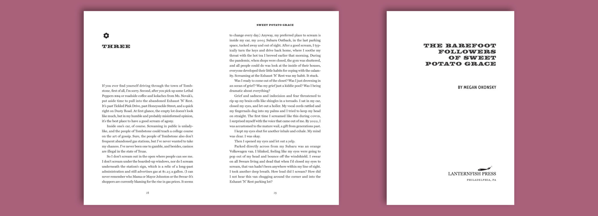
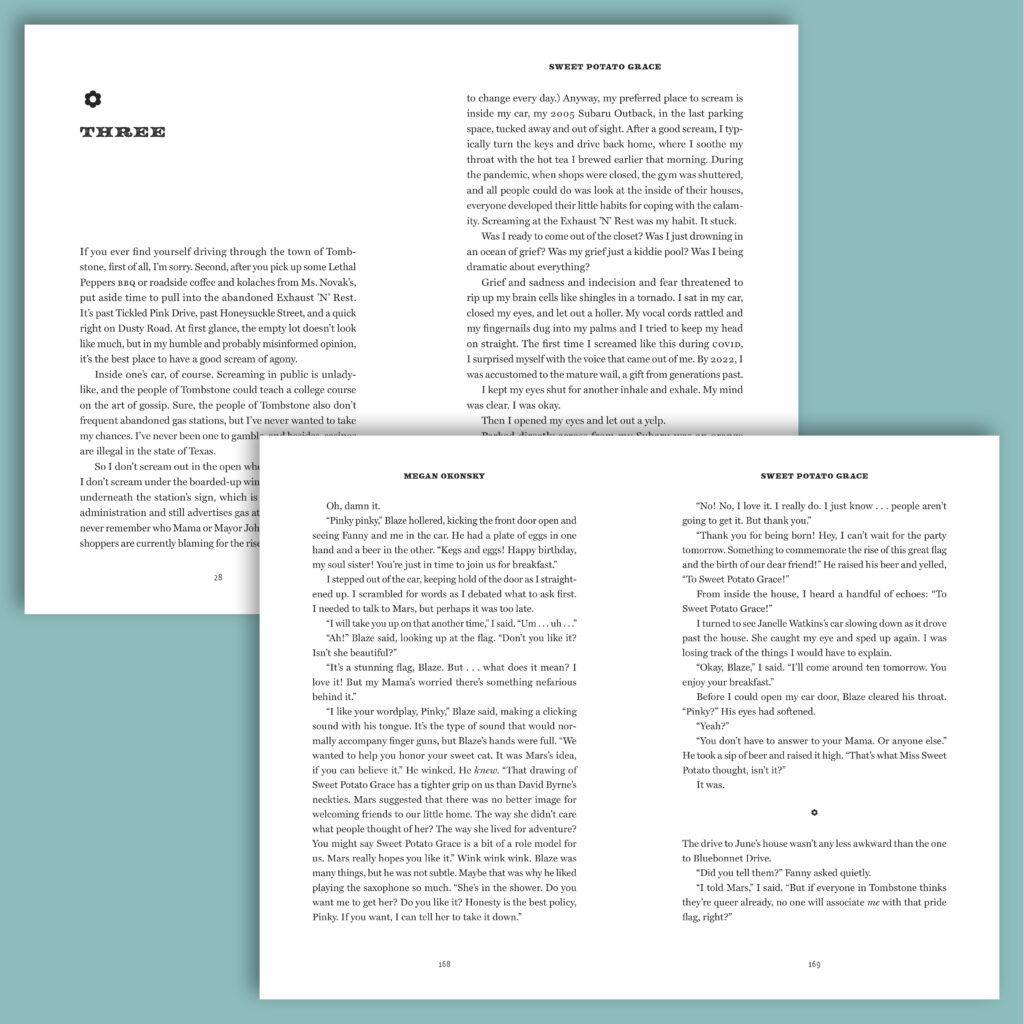
Lanternfish already had their cover done, so I was able to use that guide the interior’s design. I chose fonts that paired well with those used on the cover, in addition to using a more asymmetrical layout.

Knowing that Lanternfish loves to use ornamentation, I chose a flower to pair with chapter headings and to indicate section breaks. It compliments the bold running heads and chapter titles, while alluding to a 70s flower child, groovy tone that complements the book’s themes.
Because this book was so long, I used many typesetting techniques, including starting chapters on left or right pages (instead of only right pages) to make it a thinner book without compromising readability.
Hadley is hands-down the most organized person I’ve ever worked with, and her design skills are top notch. I was not expecting a detailed PowerPoint-style layout of the project timeline, but it was delightful!
— Christine Neulieb | Editorial Director at Lanternfish Press