ARCHIVE: Selected Work, Issues One–Ten plus "The Unintentionalist" & Issue 10
About the Client
Little Engines
Little Engines is a fun and often humorous literary magazine run by Adam Voith, with its roots in the music industry.
About the Book
ARCHIVE & Issue 10
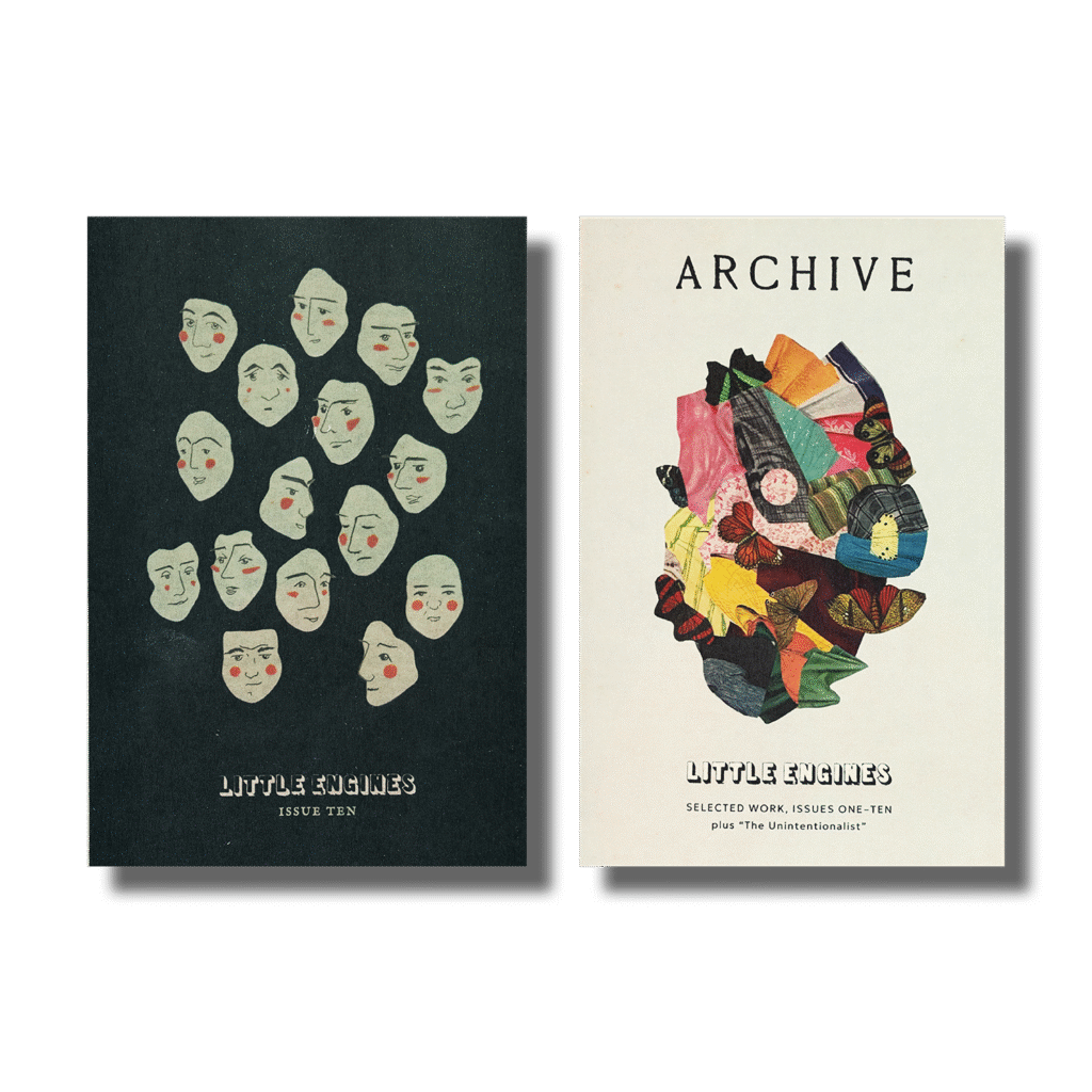
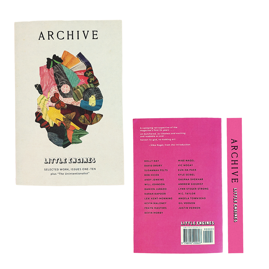
ARCHIVE is Little Engine’s first ever book, collecting work from Issues 1–10. With names like Kevin Morby, Mike Nagel, and Justin Vernon (Bon Iver), this book has an amazing line up, and I loved working with Adam to put it all together.
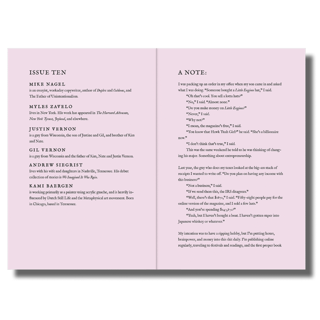
Marianna Fierro designed Issues 5-9, and Adam wanted to keep her artistic direction in Issue 10. I used the design of those prior issues to guide the design decisions in Issue 10, retaining Little Engines’ recognizable brand identity.
ARCHIVE and Issue 10 both came out at the same time, and we were rushing to get them printed in time for AWP (and we did!). It was an exciting process that showed me how much it helps when the client is just as invested as I am in making sure the project gets done right and goes to press on time.
Case Study
Hey! Just so you know: you can read a more in-depth analysis of my process designing ARCHIVE on Hadley House. (But if you’d prefer to just take a peek into the process, you can simply scroll down.)
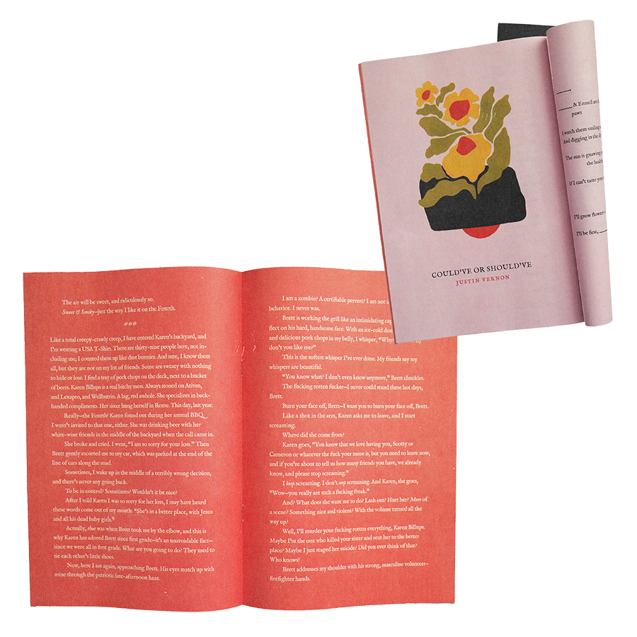
For the cover, Adam requested to use a collage by Kevin Sampsell and wanted the design to be reminiscent of their magazine issues, but not identical to them.
From all our conversations, it was clear this book should feel like both a book and a magazine. I thought about this idea when executing every design choice.
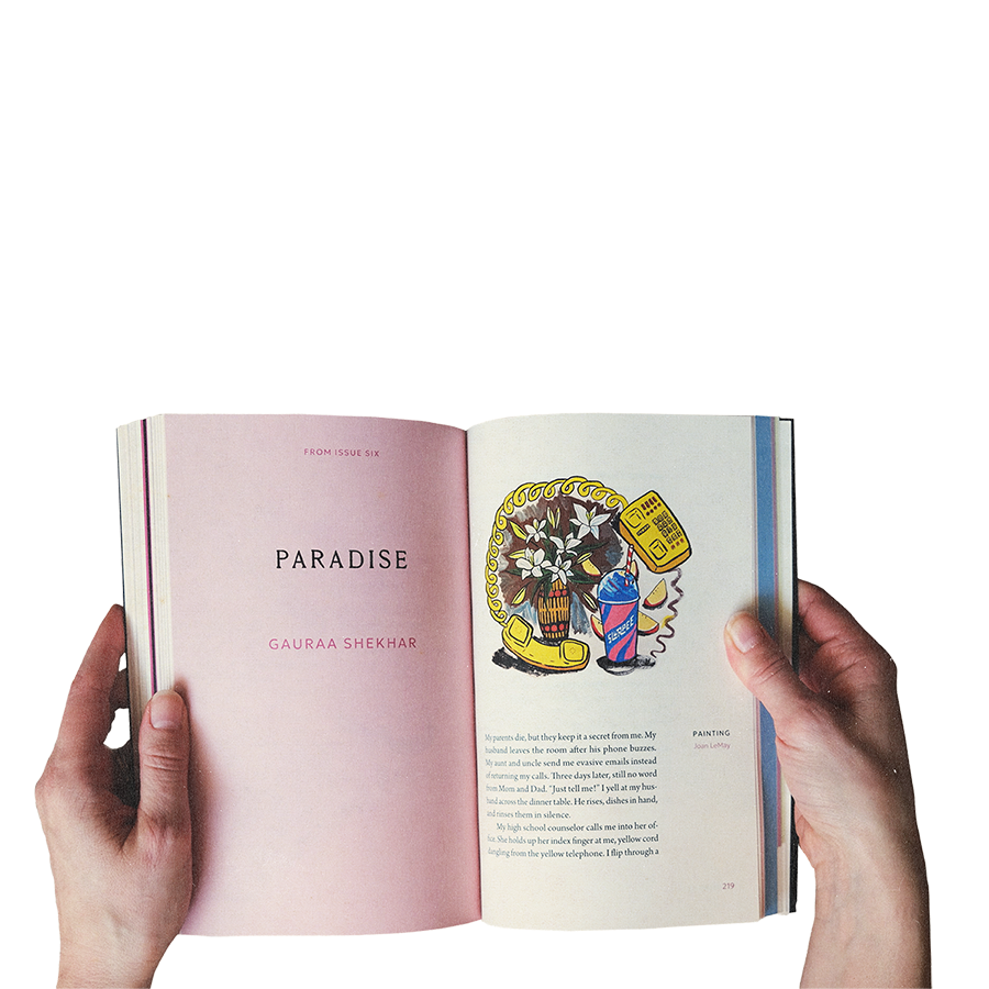
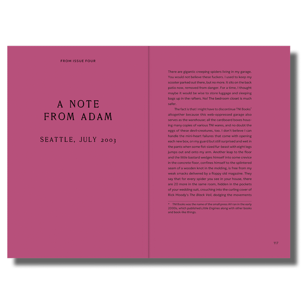
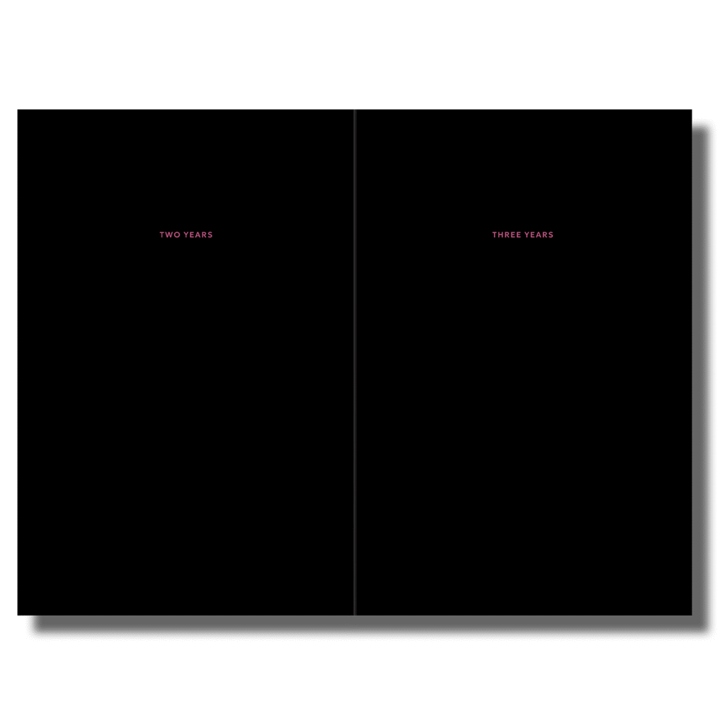
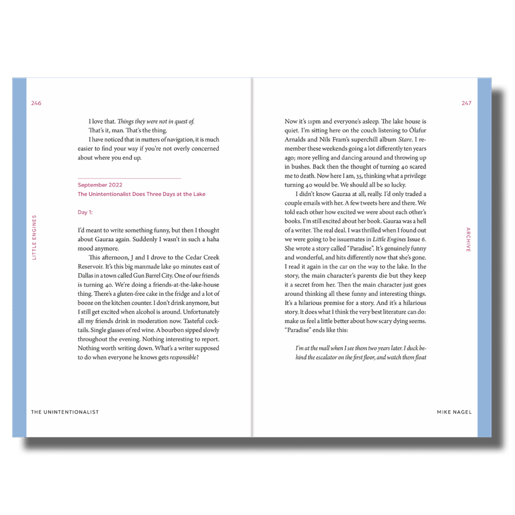
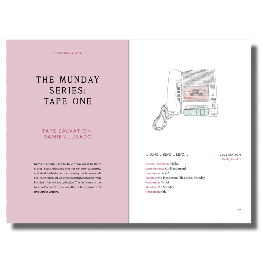
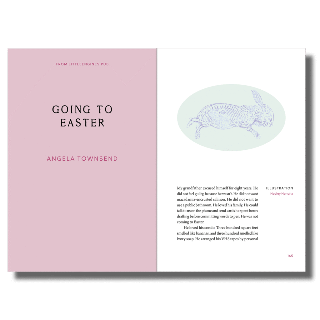
The title pages all have a light pink background (except for the “interlude” in the middle, where some pages are a darker pink and some black). Every title page has a note at the top to indicate which issue it’s from, and we hit an ideal word count of 342 due to lots of design choices, including the generous margins.
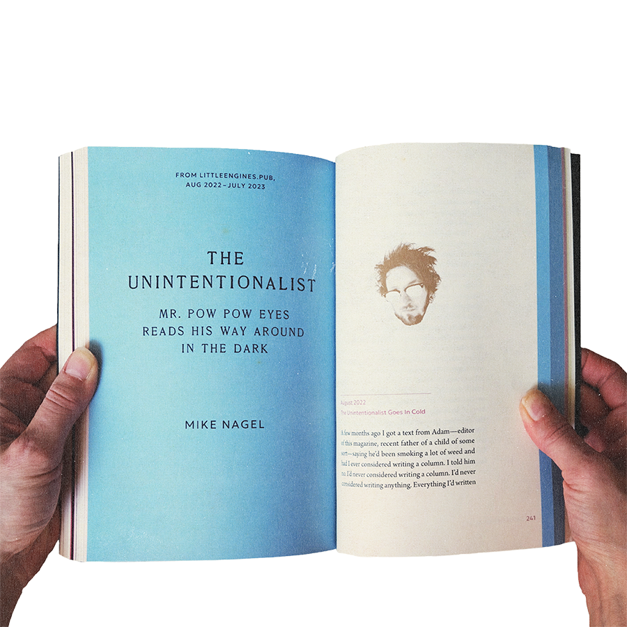
I also knew Adam wanted to differentiate Mike Nagel’s “The Unintentionalist,” from the rest of the pieces. I used Little Engine’s signature blue color for the title page and used a blue bar along the sides of this piece so it clearly stood out from the rest, while also being visible on the edges of the book to create an interesting look.
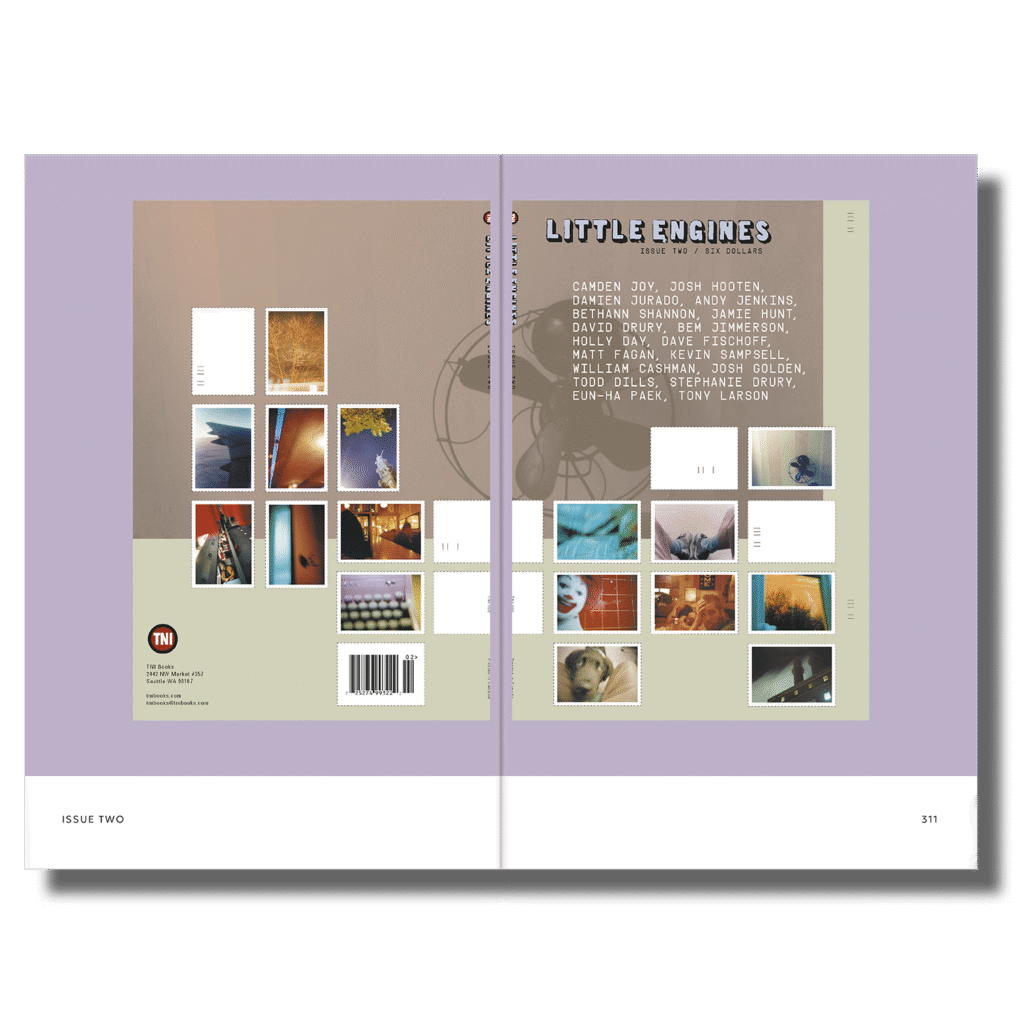
And, at the end of the book, the covers of all the Little Engines magazine issues are showcased.
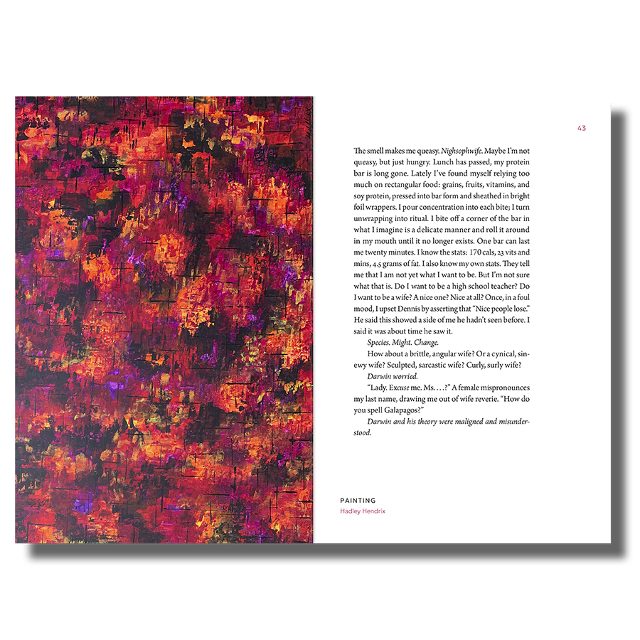
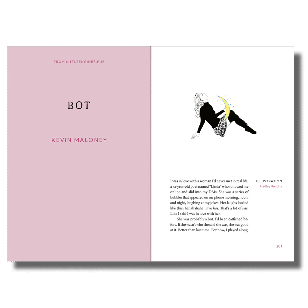
Some pieces didn’t have artwork that originally paired with them, or Adam wanted new art for them. He commissioned me to create illustrations for some of the pieces. Some of my paintings are in the book as well.
The Process
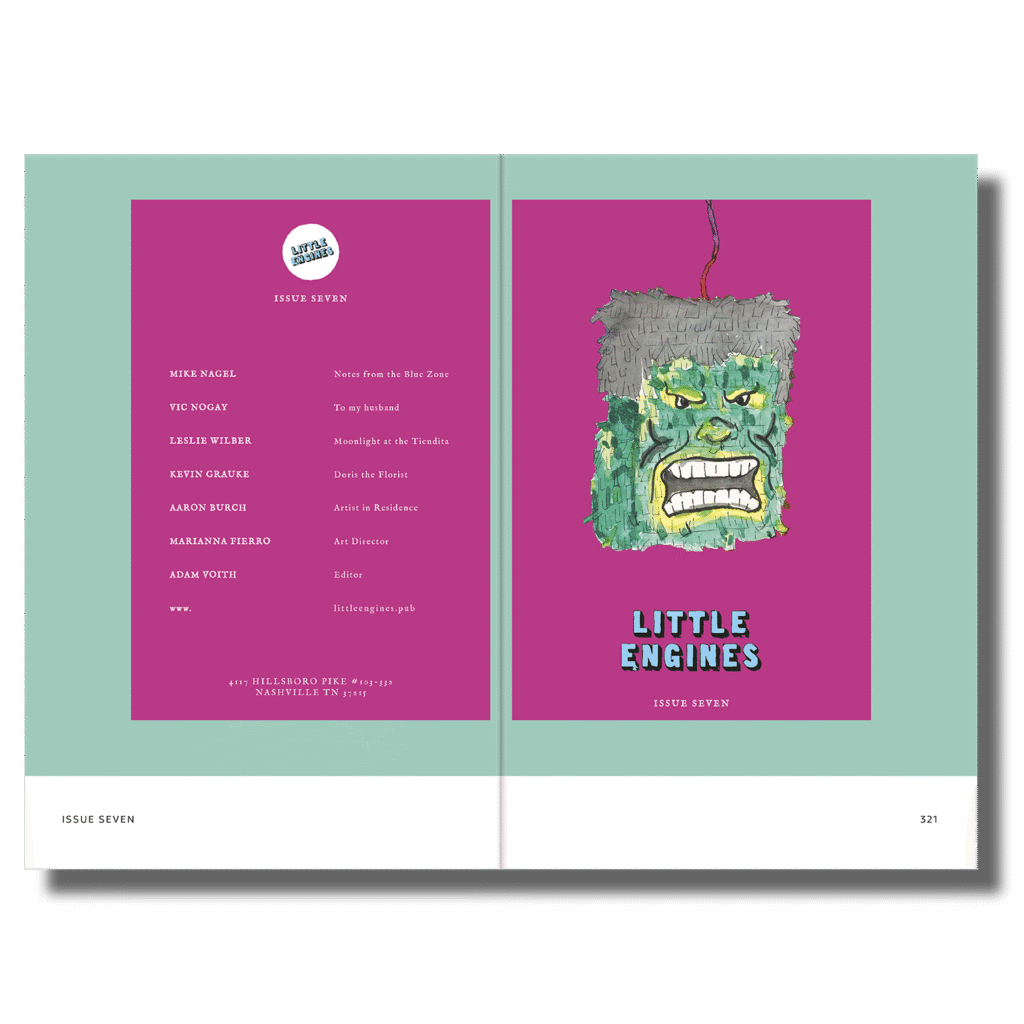
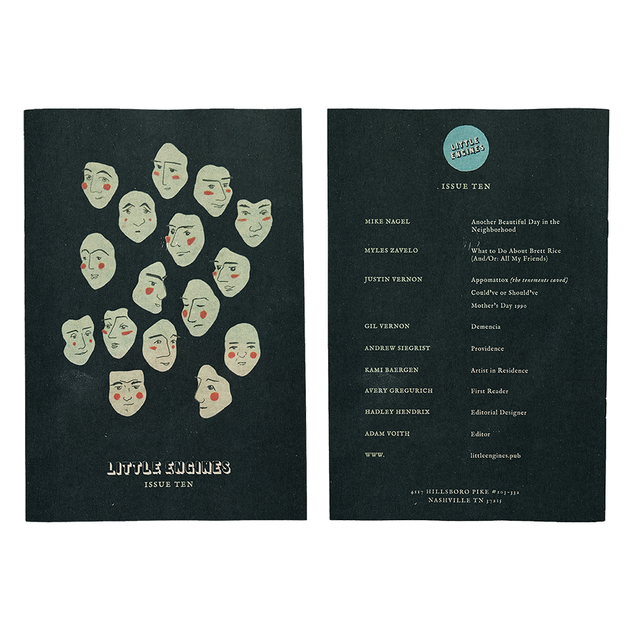
Issue 10: Magazine Design
When designing Issue 10, I worked off of Marianna Fierro’s original design template for Issues 5-9.
Using the artwork selected in the issue as a guide, I chose the colors for the issue. Black worked nicely on the cover to make the green faces stand out.
I used the green color in the faces for the text on the cover. I also inverted the logo and used the green in its drop shadow for a dark, punk, and edgy look.
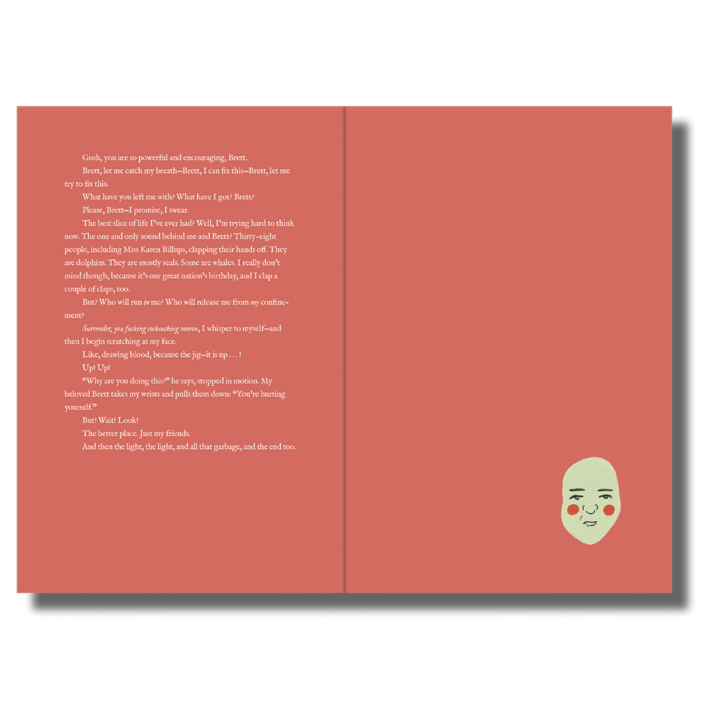
I pulled out a soft red hue from the blushing cheeks of the faces on the front cover and used it as the background for the center piece (again, using the art as a guide to ensure the issue looked cohesive!).
All the other pieces have a soft pink/purple background that complements the black and green nicely, creating a striking combination on the page edges even when the magazine is closed.