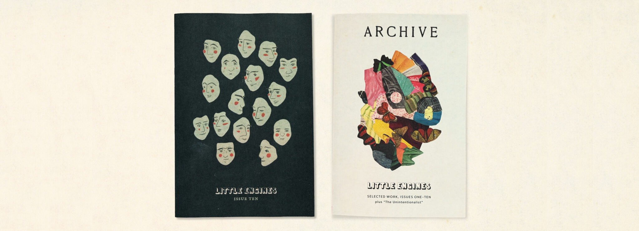
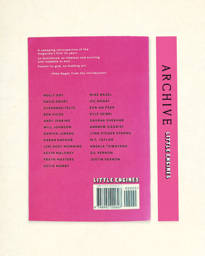
Little Engines is a fun literary magazine run by Adam Voith, with its roots in the music industry. ARCHIVE is Little Engine’s first ever book, collecting work from Issues 1–10. With names like Kevin Morby, Mike Nagel, and Justin Vernon (Bon Iver), this book has an amazing line up, and I loved working with Adam to put it all together.
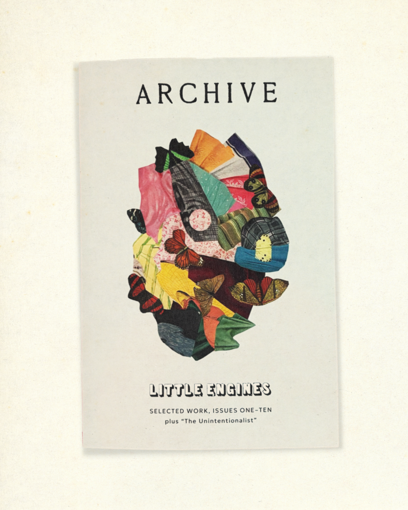
For the cover, Adam requested to use this collage and wanted the design to be reminiscent of past issues, but not identical to them. For the interior, he wanted the title page for each piece to be in color, the margins to be generous (with his ideal page count being 300-400), and he wanted to include what issue each piece came from.
From all our conversations, I thought this book should feel like both a book and a magazine. I thought about this idea when executing every design choice.
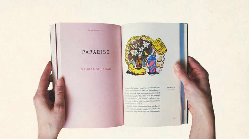
The title pages all have a light pink background (except for the “interlude” in the middle, where some pages are a darker pink and some black). Every title page has a note at the top to indicate which issue it’s from, and we hit an ideal word count of 342 due to lots of design choices, including the generous margins.
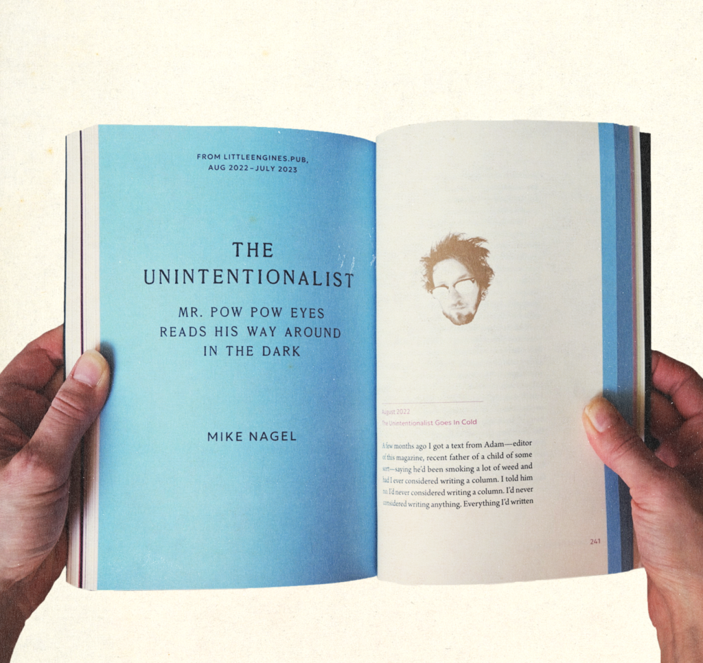
I also knew Adam wanted to differentiate Mike Nagel’s “The Unintentionalist,” from the rest of the pieces. I used Little Engine’s signature blue color for the title page and used a blue bar along the sides of this piece so it clearly stood out from the rest, while also being visible on the edges of the book to create an interesting look.
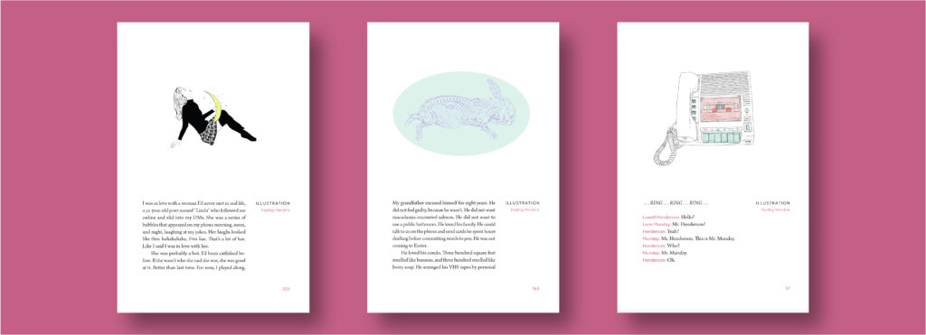
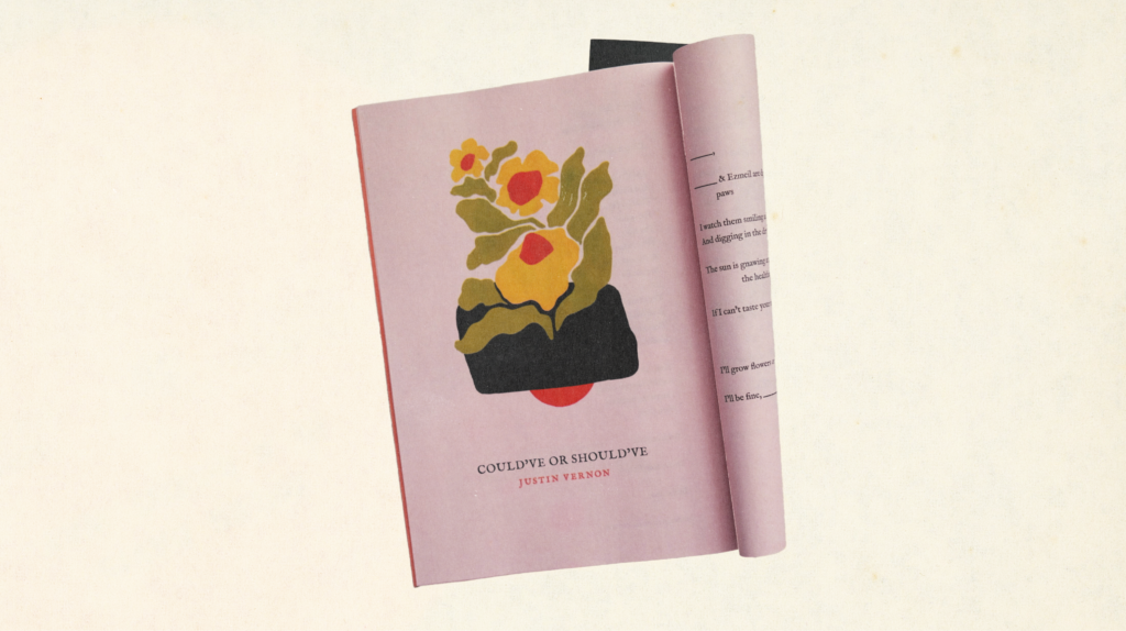
Some pieces didn’t have artwork that originally paired with them, or Adam wanted new art for them. He commissioned me to create illustrations for some of the pieces. Some of my paintings are in the book as well.
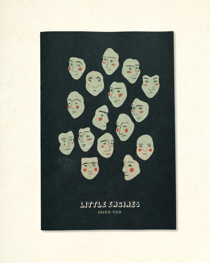
Issue 10
I used Marianna Fierro’s original design template for Issues 5-9 to design Issue 10.
Using the artwork selected in the issue as a guide, I chose the colors for the issue. I thought black worked nicely on the cover with the green faces, and I pulled out that green to use for the text on the front and back. I inverted the logo and used the green in its drop shadow to make the issue look dark, punk, and edgy.
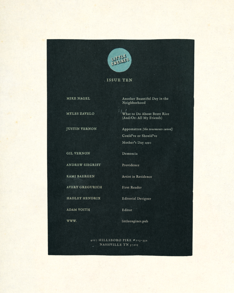
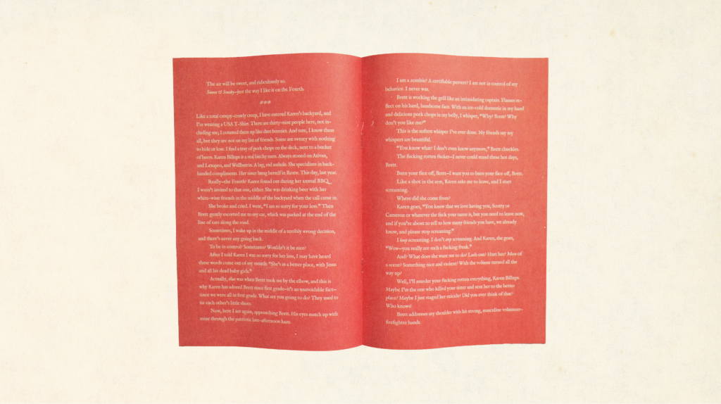
I pulled out a soft red hue from the blushing cheeks of the faces on the front cover and used it as the background for the center piece.
All the other pieces have a soft pink/purple background that complements the black and green nicely, creating a striking combination on the page edges even when the magazine is closed.