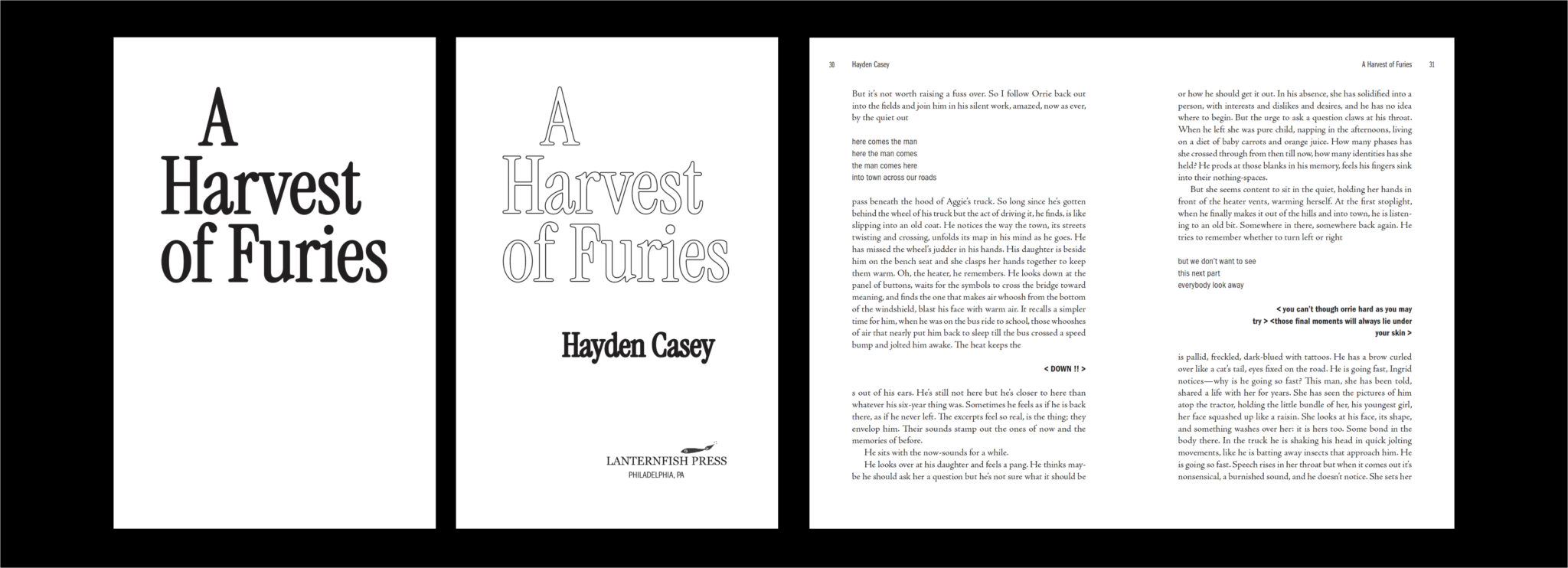
Lanternfish Press publishes rare and strange fiction that is both literary and speculative. A Harvest of Furies is a gothic novel with multiple design elements. It features special formatting requirements (such as “chorus” sections, multiple voices, and a recurring phrase, “glimmer”), which required distinctive styling to guide the reader through the novel. This was one of my favorite projects to work on!
For section titles, I chose a font that was similar to the cover title to retain a cohesive look throughout the book. Instrument Serif also looked good at smaller and larger sizes, which was necessary due to varying section and chapter title lengths.
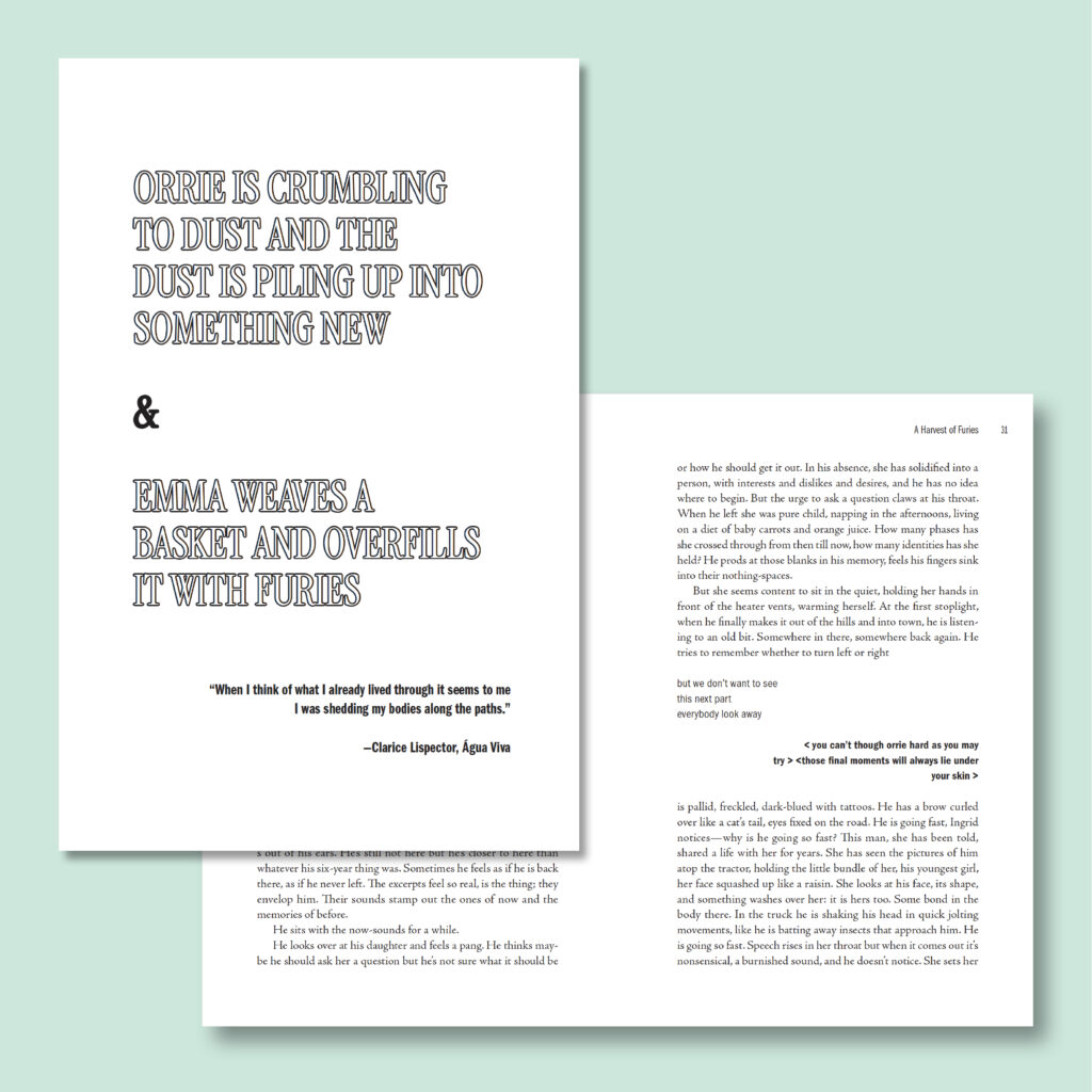
Chapter titles and numbers had to accommodate various scenarios—some chapters begin with centered or right-aligned text, others with main body text, and some have no title at all.
On Hadley House, you can read a more in-depth analysis of my process designing this interior.
Hadley is hands-down the most organized person I’ve ever worked with, and her design skills are top notch. I was not expecting a detailed PowerPoint-style layout of the project timeline, but it was delightful!