Lanternfish Press publishes rare and strange fiction that is both literary and speculative. They love the grotesque and are a home for writers and readers that refuse to be pigeonholed.
About the Book
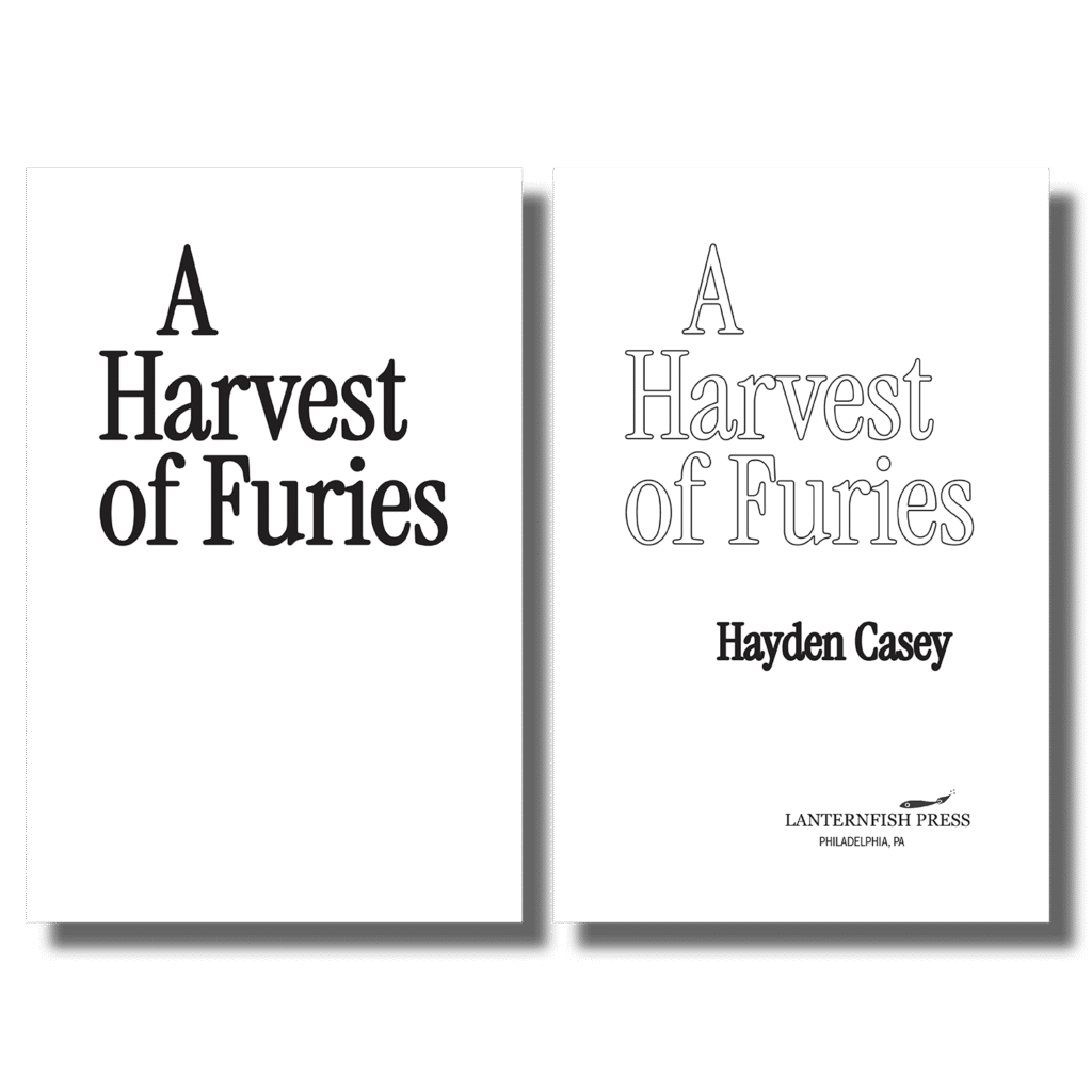
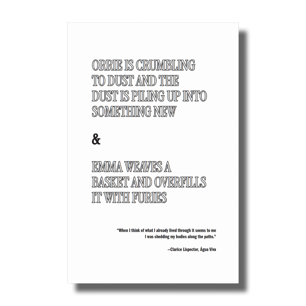
A Harvest of Furies
A Harvest of Furies is a gothic novel about a family haunted by a rumored curse that divides two siblings—one who believes, and one who resists. When their father returns from war deeply changed, secrets surface, and the family must face a dark inheritance that refuses to stay buried.
Case Study
Hey! Just so you know: you can read a more in-depth analysis of my process designing this interior on Hadley House. (But if you’d prefer to just take a peek into the process, you can simply scroll down.)
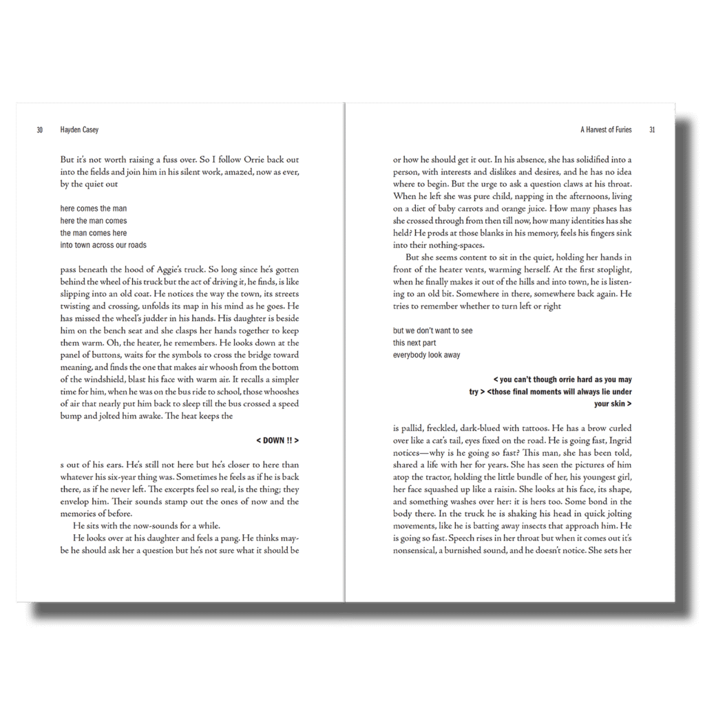
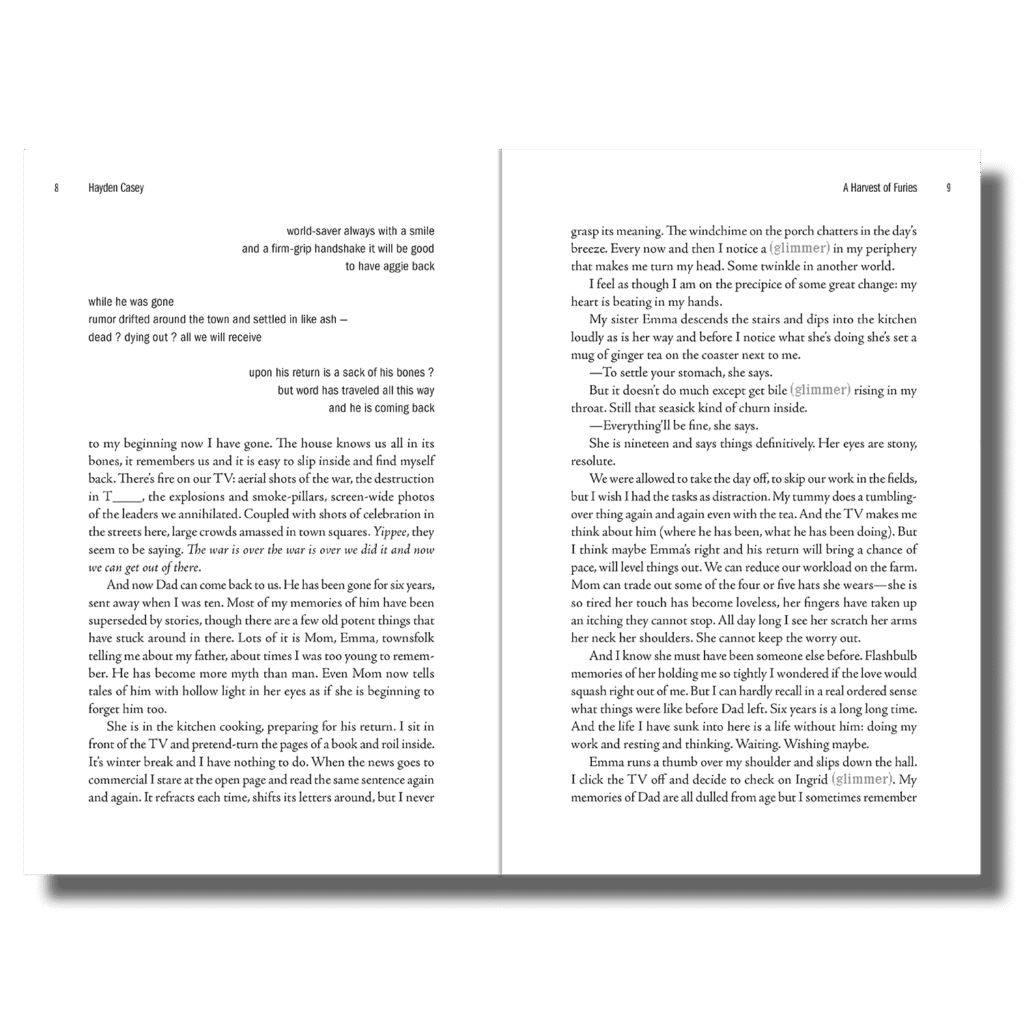
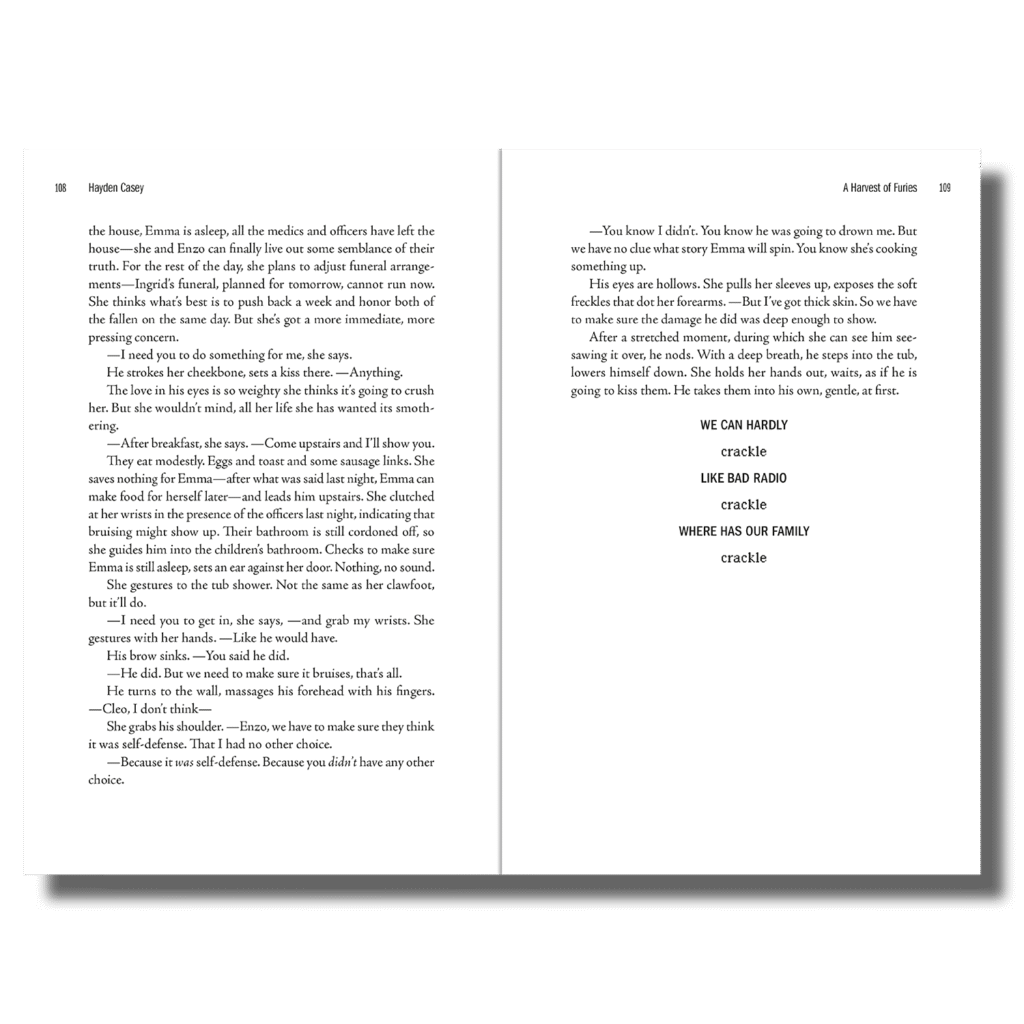
This book had many stylistic attributes that required special formatting.
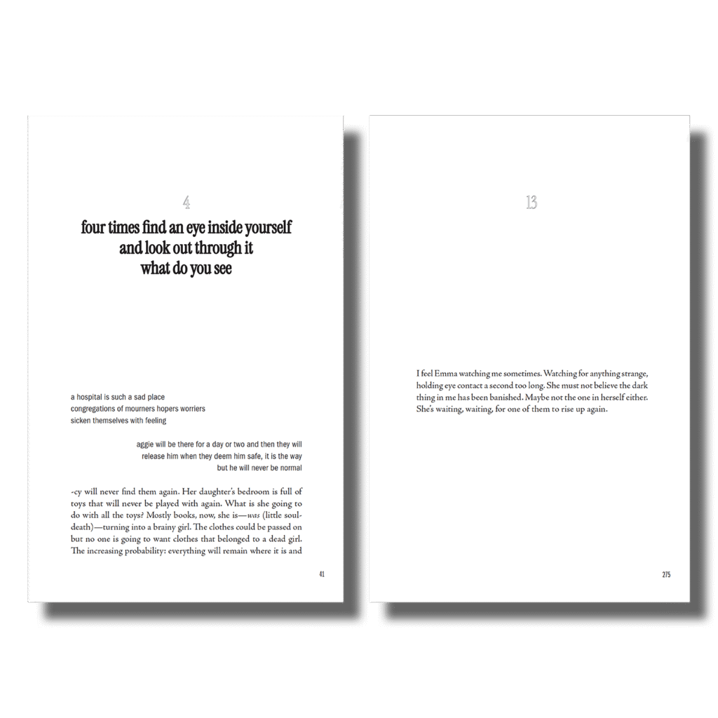
Many distinct styles had to be created to guide the reader through the novel. It has multiple point-of-view shifts, “chorus” sections, and a recurring phrase “glimmer” that had to be distinguished from the surrounding text.
For section titles, I chose a font that was similar to the cover title to retain a cohesive look throughout the book. Instrument Serif also looked good at smaller and larger sizes, which was necessary due to varying section and chapter title lengths.
Chapter titles and numbers had to accommodate various scenarios—some chapters begin with centered or right-aligned text, others with main body text, and some have no title at all.
Credits
Cover Design Kimberly Glyder
Cover Image Elias van den Broeck, Flowers, Lizards, and Insects (1883)