Inlandia Books is a volunteer-run press led by working writers. With firsthand experience navigating the challenges of publishing, their team is committed to clear communication and respect for each writer’s work and professional reputation.
About the Book
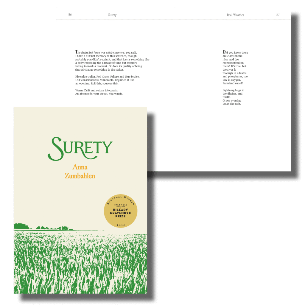
Surety
Anna Zumbahlen’s debut poetry collection Surety traverses memory while attending to the landscape of northwestern Iowa during a year that brought ecopolitical tensions to the surface of daily life in a small town.
The Process
Interior Design & Typesetting
When I’m the designer for both the interior and cover, I almost always opt to work from the inside out if it’s an option.
The cover has so much pressure attached to it, but if we work on the interior first, it becomes easier to work outwards and carry the interior’s style to the cover.
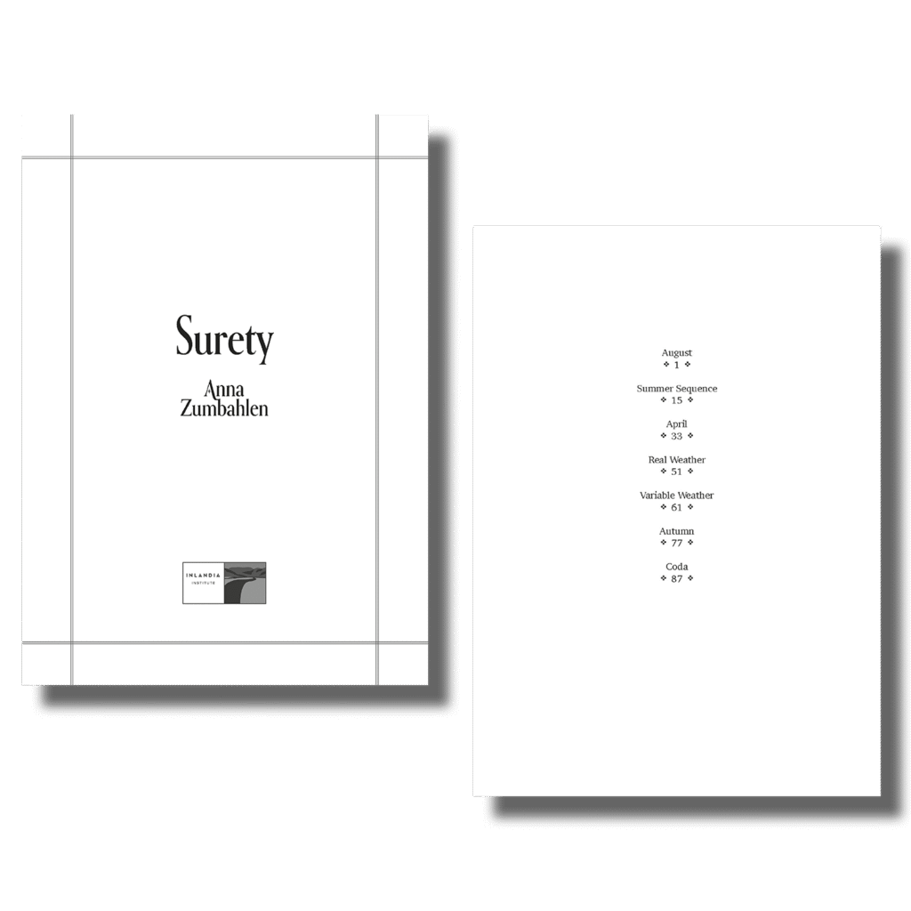
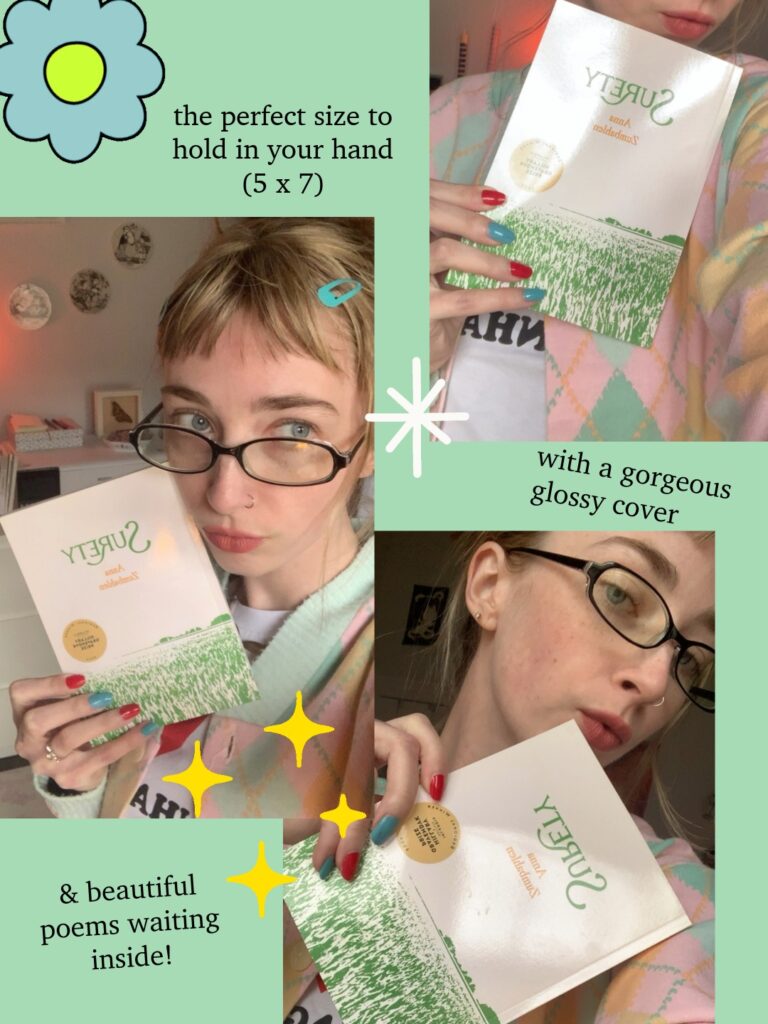
I also suggested a trim size before starting on the interior (5 x 7″), which gave us a thicker book (and thus more of a spine to work with when designing the cover). This decision made Anna’s book stand out from the usual 6 x 9″ poetry books that flood the shelves.
Although 6 x 9″ can be a great trim size sometimes, it isn’t always; each design and printing decision should be thoughtfully aligned with the specific book.
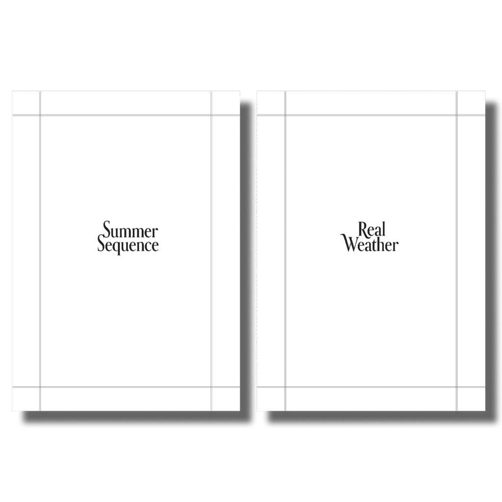
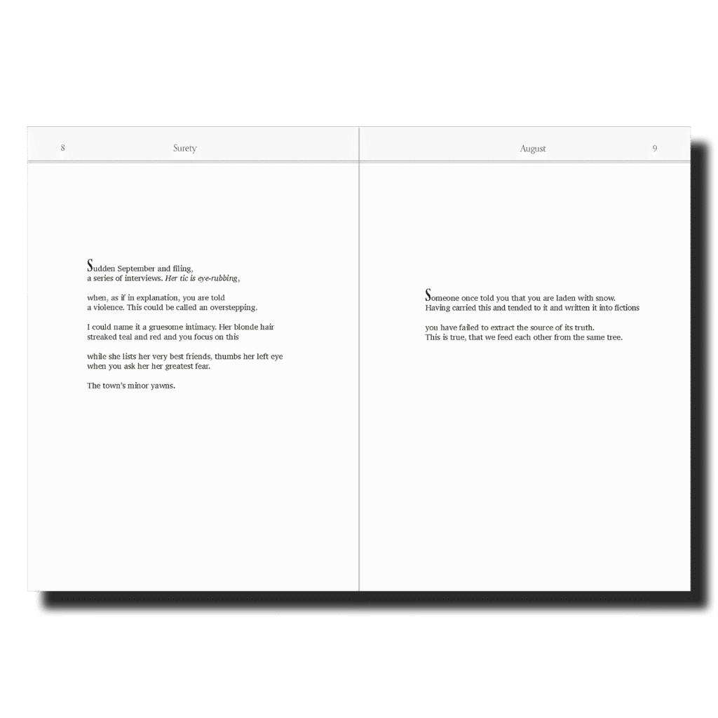
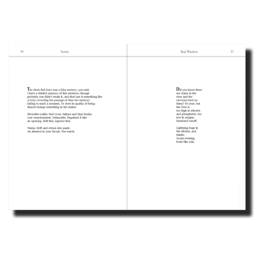
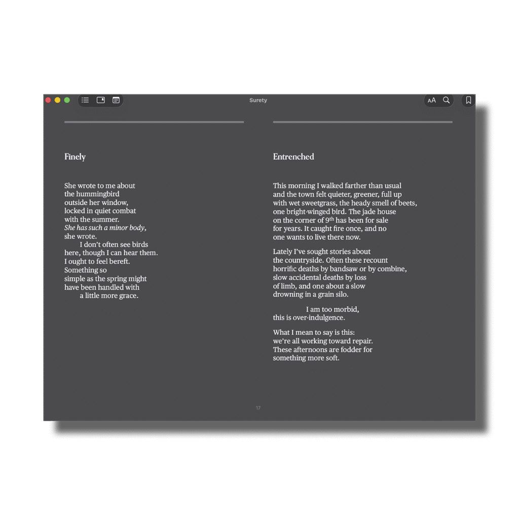
I designed Anna’s part titles with themes from our mood board in mind (vintage borders, traditional placement, and swoopy/swirly details).
A simple border frames the part titles, alluding to imagery/themes related to vignettes throughout the collection. A border also runs along the tops of each page, separating the running head from the text.
These borders add style and a vintage flair to the page, creating a unique look specific to Anna’s book. Since they bleed off the edge of the page, they can also be seen when the book is closed on the book block.
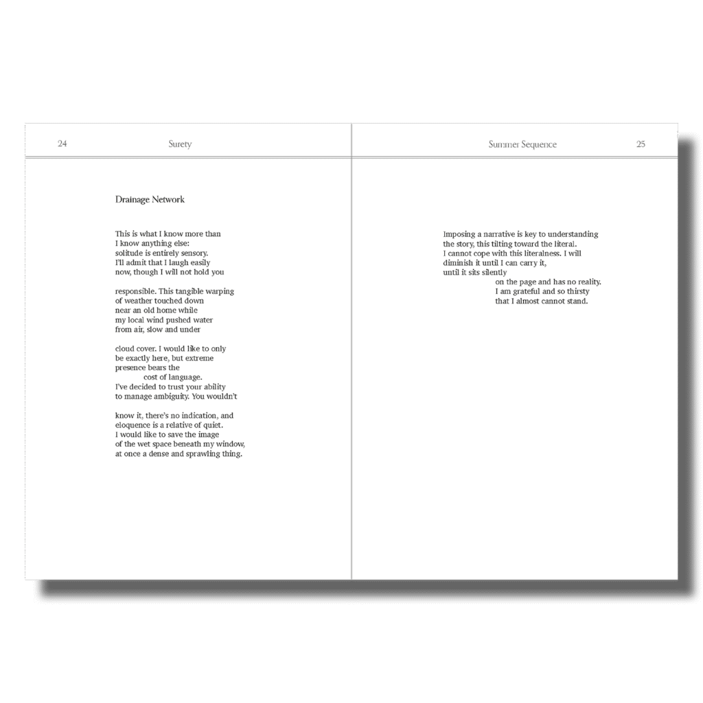
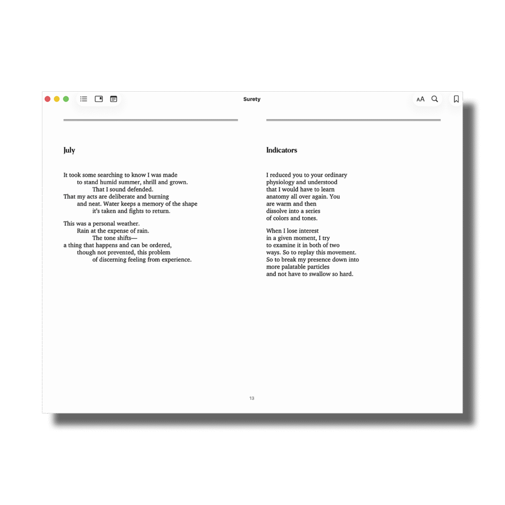
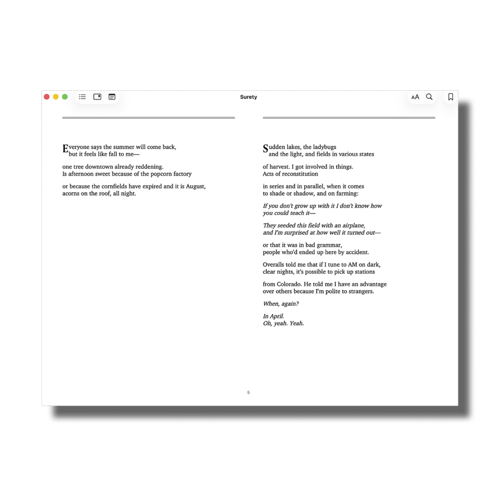
Because some poems have titles and others don’t, it presented a unique challenge. It had to be apparent that poems without titles weren’t a continuation of a previous poem with a title. I also kept in mind our goal for the poems to feel approachable and accessible to a wider audience who may not read poetry regularly.
Poems with titles use the display font Orpheus for the title. Poems without titles use a drop cap letter to start the first line. The drop caps allude to vintage traditions, which was important to Anna, and symbolizes the start of a new poem to the reader.
Every poem is positioned in the optical center of the page, making our smaller trim size feel approachable with enough space for the text and running heads to breathe.
This positioning is also a more traditional way to set poetry and makes each poem feel like a precious item by placing it at the focal point on each page.
The Process
Cover Design
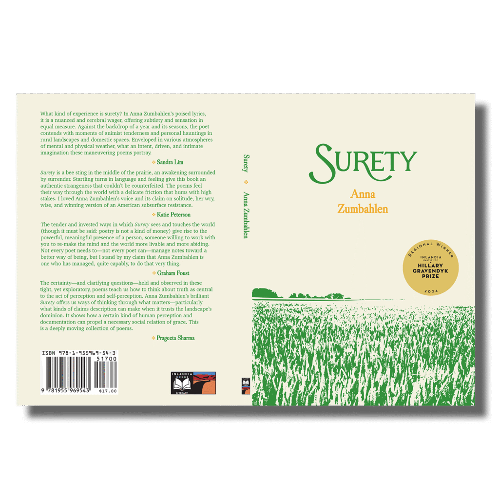
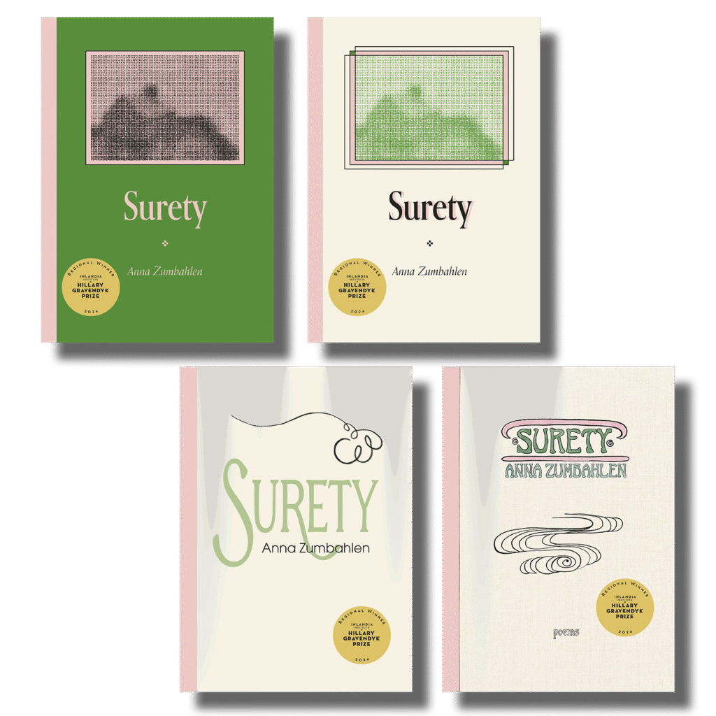
The cover feels classic and vintage but fresh enough to fit right in on a featured books table at the bookstore. The monochromatic colors, type, and negative space contribute to a comforting, homey feeling.
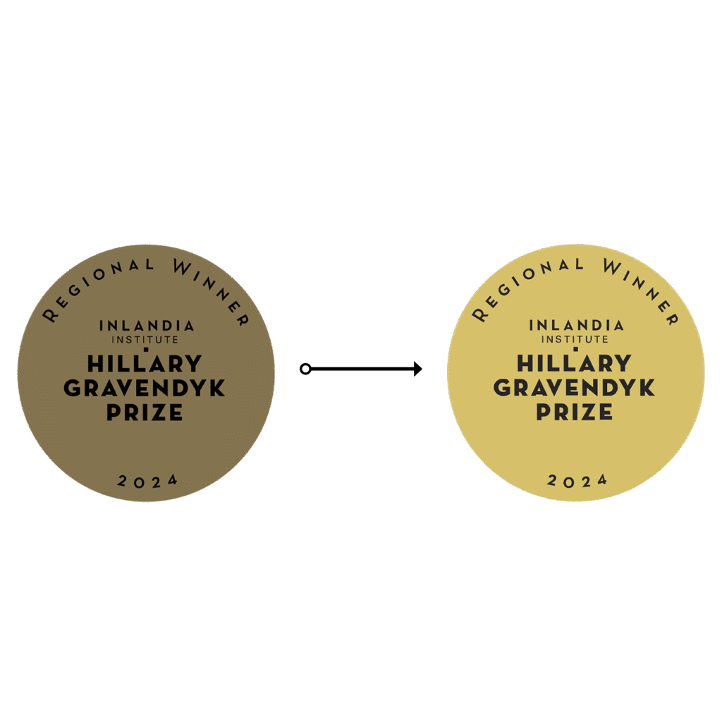
Surety won Inlandia’s Hillary Gravendyk Prize, but the original award seal that Inlandia sent me was quite muted. Due to its higher cyan and magenta values, it looked more brown than gold.
I suggested fixing this to simulate a more true gold color, which prints as a vibrant, warm yellow-gold. They loved this refresh!
Inlandia was printing with Ingram, and I knew going with their soft-touch matte would not only dull the colors, but is a finish that often screams “self-published.”
So, I suggested a glossy cover. They wanted something special, and I knew this choice would add to its charm.
(I unfortunately don’t have a fancy studio lighting setup to show you how pretty this glossy cover is, but I hope my silly little social media graphic can give you an idea!)
And, in case you’re curious, these are the unused cover concepts.
The Process
Ebook Conversion
Retaining all the beautifully designed elements of the print book isn’t always possible when converting to an ebook.
Ensuring the ebook is accessible and meets WCAG 2.1 AA requirements is the top priority.
Although function trumps beauty here, it’s usually everyone’s preference to retain as much of the design as possible. I love troubleshooting to find solutions so we can preserve these visual details without compromising accessibility.
Fortunately, I was able to preserve many of our print design elements!
Those drop caps? Preserved! They’re styled using CSS following DAISY’s guidelines. No <span> tags are used in the HTML to style those babies (that would be an accessibility no-no and would result in the drop cap getting read as its own word, effectively breaking the word apart).
Superscript? Preserved and styled properly in the CSS to avoid the line height changing.
Even the borders that line the tops of pages in the print book have been preserved! Again, I’ve used CSS to style these and they adapt to the background color (dark mode? not a problem!).
Credits
Executive Director Cati Porter
Book layout & design Hadley Hendrix
Cover art a derivative work from a photograph by Alex Henderson
Title lettering Tony Legato
Hadley is SO organized and efficient!
And the client portal really is a fantastic tool.
We’ve never worked with a more professional designer.
Every step was outlined clearly and follow through impeccable and the fact that she was willing to work with the author directly meant there were no middlemen, so to speak.