Hardie Grant publishes incredible cookbooks, as well as children’s books and non-fiction. For this project, I inherited master InDesign files for the original version published in French. Typesetting a translation is always difficult because the English text has to fit exactly where the French text did. This way, printing is easier and more cost-efficient because only the black plate (used for the text) needs to be changed.
When typesetting a cookbook, I pay attention to many different factors that could influence readability (ensuring numbers stay with their partner—a fraction with its respective measurement, for example—avoiding word and letter stacks, ensuring appropriate hyphenation, and balancing ragged lines to create a smoother edge on the text block).
With so many considerations in mind, typesetting is a delicate balance that necessitates compromise.
Typesetting a co-edition requires a careful eye. Even though these illustrations are in black ink, for example, some of them are not on the “text” layer (which means I couldn’t move them to fit the text). Essentially, I had to typeset around the illustrations, using typesetting techniques that include (but aren’t limited to) slightly adjusting the tracking of some lines to accommodate more text, switching paragraph composers, and adjusting H&J (hyphenation and justification) settings.
Because objects that aren’t on the text layer must stay locked in place, it makes typesetting more complex. Sometimes, the translated text is just too lengthy, and I have to go back to the editors to alert them of this overflow. I avoid doing this unless it’s truly not able to fit (I realize editors have a lot of work on their plate already!), but sometimes this collaboration is necessary.
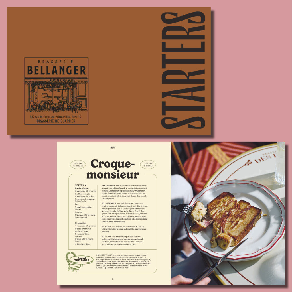
In this book, there were some pages that used justified text in their layout (as opposed to a flush left / ragged right alignment).
Justified text is usually more difficult to typeset than text with a ragged edge, especially as the text frame/column becomes narrower.
Every typesetting choice is fine-tuned to make recipes as easy to read as possible. When you’re making a recipe, it can be hectic (you’re glancing at the cookbook, your glasses are steamed up, and you’re trying to find where you were)—you don’t want to accidentally do the same step twice because a word stack confused you!
Hadley is stellar with her communication and organization. I found her notes at each stage to be super helpful, whether they were about her design choices, things she was flagging for us to keep an eye on, questions, or general notes about where the project started, its current stage, and next steps. Hadley’s clear communication helps close any gaps that can happen when working remotely and makes it easier for me to manage the project. She is very thoughtful with her work and brings great technical knowledge to the table. It is a pleasure to work with her!
— Natalie Lundgren, Editorial Assistant at Hardie Grant